Font Psychology: How Typefaces Hack Our Brains
The world contains over half a million fonts. Even though most websites are built using a handful of fonts, there is a lot of room to branch out. Typography is a visual element, so you can use it to paint a psychological narrative that supports the mission of your site.
A font’s impact on readers’ perceptions of a text, a product, or even an entire website is similar to that of other design elements. The fonts you choose for your site have an impact on the design of your website and, therefore, on its conversion rate optimization.
Choosing the right fonts isn’t an easy task. Even the slightest tweak can increase or decrease the success of your site and can take months or years of trial and error.
It’s time to take a closer look at how fonts work on a psychological level, and how you can choose the right font for your design.
Let’s spill the bean!
What is font psychology?
The psychology of font is an incredibly powerful concept. Choosing the right font will have a significant impact on how your audience feels about your product or brand. The study of font psychology examines how font styles can affect audiences’ feelings, emotions, and behaviors.
In this case, using Roboto instead of Times New Roman will reflect as modern and clean rather than traditional and old.
Font psychology entails identifying how each font affects a person’s emotional state.
Why is font psychology important?
The psychology of fonts is important because it helps you choose the right font for your project. It is important to think about how the audience will perceive your product or brand when designing it. Are they going to be satisfied, intrigued, or happy?
Based on what you anticipate an audience will feel, you align your logo, voice, style, colors, and layout accordingly.
Fonts, however, are important in communicating a brand’s or marketing message so that your audience can feel the emotion you want to evoke.
The psychology of fonts will help you to grasp the perception of each font and how you should use them to attract your audience.
Major Font Styles and Psychology
The majority of fonts can be classified into six different categories. Let’s examine them individually.
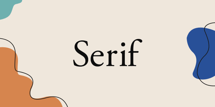
1. Serif
This font is traditionally used for large amounts of text, mostly paragraphs, in magazines and newspapers as it is easy to read. It reveals a variety of characters and personalities through the smallest details.
Serif fonts are a mark of class, heritage, trustworthiness, traditionalism, and formality. Ideally, serif fonts should be used for logos, body copy, and titles.
Serifs are distinguishable by the small extra stroke at the end of a few letters. There are many popular serif fonts, including Playfair display, Merriweather, and Times New Roman.
Brands such as Time Magazine and Vogue use them to convey respectability and tradition.
What adjectives typically describe serif fonts?
- Traditional
- Respectable
- Elegant
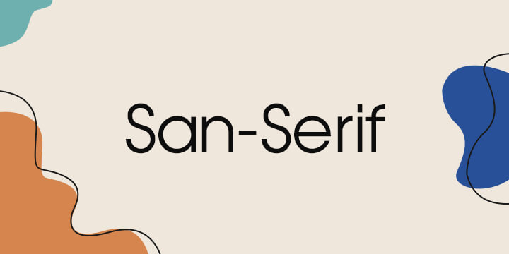
2. Sans serif
With their clean lines and crisp appearance, sans serif fonts are minimal and pleasing to the eye. This font is straightforward and embodies a no-nonsense attitude, yet it feels progressive and open as well. Simple, yet effective, sans serif takes a simple yet elegant approach.
Sans-serif fonts are commonly found in Roboto, Arial, Helvetica, Source Sans, Open Sans, and Segoe UI.
Among all the fonts available, these are the most simplified. They exhibit honesty, modernism, clarity, and cleanliness. These are best for small text, body copy, logos, and titles.
Big brands like Google, Facebook, and Spotify use sans serif font for greater readability.
What adjectives typically describe sans serif fonts?
- Morden
- Straightforward
- Tech-focused
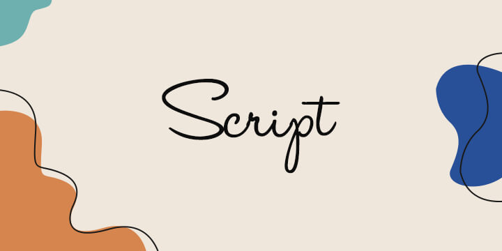
3. Script
The script font is fancier than serif fonts and reflects handwritten or cursive writing. Script fonts also look different and unique like everyone’s handwriting. Most of the time, they are formed by letters flowing together fluidly.
It may be difficult to read script fonts since they are distinctive and cursive. Be careful while using them. Avoid using them for long-form writing. They work best for short calls to action.
The most popular script fonts are Pacifico, Dancing script, Lucida script, etc.
The script font offers elegance, creativity, informality, and a personal touch. You can use them to create logos or fancy headlines.
What adjectives typically describe script fonts?
- Creativity
- Uniqueness
- Personal
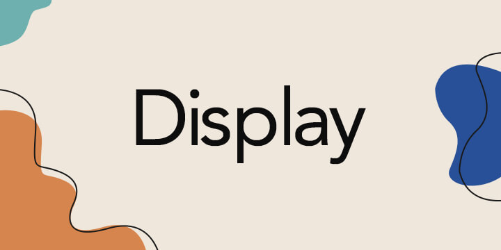
4. Display
Display fonts are all about attention. They differ greatly and only have one thing in common: they are superstars — not background singers.
They shouldn’t be used often, and should never appear in body copy. But when they are used well, they accomplish a very specific objective to catch eyes and draw people in.
What adjectives typically describe display fonts?
- Friendly
- Quirky
- Unconventional
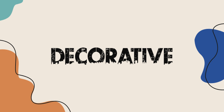
5. Decorative
The variety and uniqueness of decorative fonts are greater than those of script fonts. The fonts do not have any standard structure, and each of them has a peculiar design, layout, and stroke, just like graffiti fonts.
Creative fonts are not classified under any font category, so they are Decorative fonts. Usually, they will design logos and headlines, as well as calls to action. Several brands including Lego, IBM, and Disney utilize Decorative fonts in their logos.
Fonts that are considered decorative should be used sparingly since they are very trendy and may become obsolete over time. You can find decorative fonts like Bangers, Fredoka One, Lobster Two, etc.
What adjectives typically describe decorative fonts?
- Creative
- Original
- Flexible
Other persuasive font techniques
Understanding font psychology takes more than just knowing what emotional baggage the audience carries concerning certain font families. There are other subconscious effects a font can have on the brain. Knowing how the human brain deciphers and perceives a certain font can help you to unlock its true potential or avoid any hidden pitfalls that might hinder your message.
Light vs Medium vs Bold Fonts
- Light font-weight is often related with a feeling of delicate and softness due to their thin look and this weight is recommended to be used as paragraph text if you want to create a feeling of modernity paired with bold text like a heading to create a high contrast effect, and due their thin anatomy avoid using them as headliners because they don’t work well for grabbing the viewer attention.
- Medium font-weight is the most popular and recommended weight to use for paragraph and long body texts, they are the most readable weight because they are not too thin or too bold, medium font-weight can be associated with a clean and crisp look for your design.
- Bold font-weight is the perfect choice for titles or headlines because they are designed for grabbing the viewer’s attention and creating emphasis on a specific text from your design layout, usually the most important part of it. Bold fonts are also a popular choice for logo design due to their anatomy and easy readability in different sizes (small pieces of text) and usually, bold weight is associated with a powerful message.
Character Widths
- Regular tracking in fonts is the most suitable width if you’re more concerned with easy readability, which is best suitable for paragraphs and long texts and is associated with natural and legible feelings.
- Condensed tracking consists of a small space between the letters, and this width is recommended for fitting more text into small spaces, and it is more appropriate to use this tracking for titles compared to body text because it can make it harder to read. Modern and playful feelings are often associated with compressed tracking.
- Extended tracking is characterized by a wide separation between letters in your font style and is usually used on a wide area, making the text easier to remember and easier to read. Additionally, extended tracking is often associated with a mature, clean, and fresh look.
You can find the latest and most comprehensive font collection on our collection of the best websites.
1. Google Fonts
2. Adobe Fonts
3. DaFont
4. Font Squirrel
5. BeFont
6. Cufonts
Final Takeaways
There is more to words than meets the eye. They carry a message beyond the meaning of the word.
One thing is the meaning behind the words. Style can be completely different from the emotions it evokes due to the way it looks and feels.
Several of these are works of art. Others are scientific and more specifically psychological. By learning all the nuances of your audience and how subtle messages are conveyed, you will be able to tap into this new way of thinking.
It is important to choose fonts that reflect your brand’s voice and establish your brand identity. When working on a project, it is a good idea to keep font psychology in mind.
Choosing fonts for your next project requires a deep knowledge of the brand personality, your target audience, their interests, the voice and tone of your message, and subsequent emotions.