The Principles to Follow For Designing Attractive Social Media Visuals
What do social media and graphics have in common?
Well, there are a number of potential answers. But the one we’re looking for today is, they both are incredibly appealing to internet users.
Consider these statistics:
- People spend, on average, almost two hours a day on social media.
- Image-driven content, especially posts to social media, produce up to 650% higher engagement rates than text-only posts.
Not only do these facts tell us a lot about what people are looking for, they also suggest that social media and graphics-based content are a match made in branding heaven.
So in order to get the most bang for your buck, metaphorically speaking, let’s look at five of the most important underlying principles to designing social media visuals that pull their weight. Again, metaphorically speaking.
1. Focus On Your Style or Brand:
Social media content, especially visuals, tends to be fairly diverse. Just scroll through your Facebook feed to get an idea of this: the pages, groups, and individuals you follow all have their own ideas, missions, and interests, which results in most feeds becoming something of a hodgepodge.
And that’s fine when you have several different sources all coming together in the same place. But it shouldn’t be the case for your original content, overall.
To create a social media account that flows is homogenous, and presents an appealing harmony, keep your brand and style in mind when putting content together. Usually, your logo design sets the theme of the brand platform but that’s not always the case. Ideally, your followers should be able to tell that a certain post came from you, even without checking the @ tag.
Each individual post should promote the personality, sensibility, and driving aesthetic behind your brand, and that includes across all platforms.
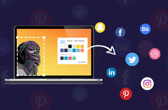
2. Choose A Visual, Size, And Layout That Suits The Platform:
Different social media platforms have different requirements when it comes to sizing and resolution. Here are a few of the recommended sizes by Sprout Social for popular sites.
- Twitter: In-stream photo minimum of 440×220 px.
- Instagram: Recommended 1080×1080 px.
- LinkedIn: Recommended shared image 1104×736 px.
The layout also differs from platform to platform, as well as from image type to image type. A banner or profile pic on any of the above platforms will be different than a shared image.
Instagram allows either square or rectangle image posts. A company logo on LinkedIn is actually smaller than a personal profile picture.
With all that, it’s also important to consider which type of visual you will use for a certain platform. While it’s tempting to just use a cut-down or expanded version of the same visual across the board that may not be the most useful decision.
Different social platforms tend to appeal to different demographics; you may find a more casual audience on Instagram, a business-oriented audience on LinkedIn, a crafty, creative audience on Pinterest. So varying your visuals according to the platform is a good way to make sure you’re appealing to the right demographic.
3. Choose Visuals That Send the Right Message:
At times, we want to just rely on the text content we include to tell our viewers exactly what a post is about. No beating around the bush: let’s get the message across.
That’s fine, except sometimes that means we’re not letting our visuals do and be all that they can do and be. Carefully chosen visuals are just as capable of getting a message across as text-based content.
Even worse, sometimes the visuals that we choose actually contradict the message we’re trying to send.
There’s a reason why they say that a picture is worth a thousand words. Choose your visuals carefully, and let them be the main part of your image-driven post. Keep text content to a minimum wherever possible, and make sure that your visual and your text are both making the same point.
4. Be User-Friendly:
Of course, sometimes you do need to use text content in your visual post. And when that is the case, make sure to choose a clean, legible, visually appealing font at an easy-to-read size. No one should have to read your text over and over again to try and figure out what it says.
In the same way, even the visual itself should be user-friendly and easy to decipher. Don’t choose a confusing image or one that is too dark or too low resolution to the point that no one’s quite sure what they’re looking at.
The perk of paying attention to this principle is that user-friendly posts are also share-friendly posts. If your content is appealing and easy to read or decipher, it’s much more likely that your viewers will want to share it with others.
5. Don’t Overstuff:
If you have a lot of good content that you want to get out to your viewers as soon as possible, it’s tempting to post several visuals at the same time. Whether as a slideshow or even as a collage, the sooner you post, the better, right?
This isn’t exactly the case.
Posting too much at one time can lead to content exhaustion, meaning that your audience loses interest because there is just simply too much to look at. And stuffing all your content into one post, like a collage, detracts from the individual visuals, which means that your viewer won’t really get the full impact of any one piece.
Front-loading or over-stuffing your social media accounts like this could actually detract from your brand, rather than enhancing it. Set a reasonable, regular posting schedule, and stick to it, keeping the integrity of each visual rather than forcing them to jumble up together like some weird science experiment.
Conclusion:
Creating effective social media content is challenging, but by no means impossible. And when it’s done right, the benefits to your brand can be enormous! So while it can be a lot of work to stick to principles like these, it definitely pays off in the end.